
Website for a Fitness Studio or Personal Trainer in Australia
A fitness site has to sell the outcome, not the equipment. Here's what it needs — a clear transformation, visible pricing, and a one-tap start.
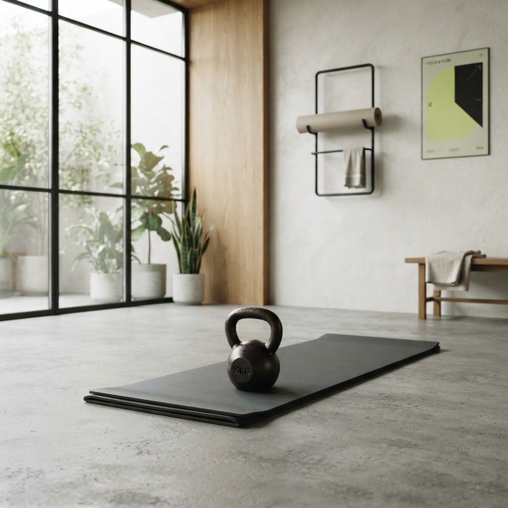
A fitness site has to sell the outcome, not the equipment
People don't join a gym because of the equipment; they join because of what they hope it'll do for them. Yet most fitness sites I see are photos of kettlebells and a class timetable — the hardware, not the reason. A good fitness site sells the outcome ("get stronger", "train for your first half-marathon", "small-group strength for busy people") and makes starting easy. A bad one shows the gear and hopes.
Here's what a fitness studio or personal trainer site actually needs.
Lead with the transformation, in plain words
What does training with you do for someone? Be specific. "Small-group strength training for women", "running coaching for beginners", "personal training for busy professionals", "rehab and return-to-training after injury". A visitor who wants one of those immediately knows they're in the right place. A homepage that says "achieving your fitness goals" says nothing and helps no one.
Make starting frictionless
Fitness has the same conversion rule as health: the decision is often impulse — someone decides on a Sunday night that they're starting Monday. A "book a free intro session" or "start a trial" button, obvious on every page, is the most important element. Bury it behind a contact form and you lose the people who were ready to start. The first session is the whole funnel; make it one tap. (More on this: how to get more leads from your website.)
Pricing, visible
Fitness sites that hide pricing lose people to the ones that don't, because the assumption is "no price means too expensive". You don't need every option, but a clear idea of what a casual visit, a 10-pack, and membership start at saves the enquiry that half your visitors would rather not make. List it plainly.
Real people, real results
Fitness is sold on proof. A few real before-and-afters (with permission), client testimonials, and photos of actual members in the actual studio. Not stock models in pristine activewear — real people, looking like they actually train there. This is the part that converts, and it's where most fitness sites are thinnest.
Local search matters for studios
People search "personal trainer [suburb]", "gym [suburb]", "yoga [suburb]". The studios that show up are the ones structured for it — clear service pages, location, content answering the questions people search. A studio that does this well books more trials from search than one that doesn't. We wrote the diagnosis: why your website isn't getting any customers.
The pages a fitness site needs
A homepage with the transformation, a start button, and proof. A page per offering (personal training, small group, classes). A pricing page. A team page for the trainers. A contact/location page. That's the spine. A few articles on training topics help with search over time. (How many pages: how many pages a small business website should have.)
What to skip
Stock photos of impossibly fit models. A class timetable that's a PDF. Autoplaying workout videos. Anything that makes the place feel intimidating rather than welcoming. A fitness site should feel achievable, proven, and easy to start from.
What it costs
A proper fitness site — outcome-led, proof-led, structured for local search — sits below what most studios assume. The numbers: how much a website costs. For a studio, it pays for itself in a few new memberships.
See yours before you pay
Pick a style below, tell us about your studio and who you train, and we'll mock up your site for free — no payment, no obligation. You'll see whether the version of your studio we'd put online is the one that gets someone to start.