Website for a Dental Clinic in Australia
A dental site has to overcome the reluctance. Here's what it needs — including talking about nervous patients, which most clinics skip.
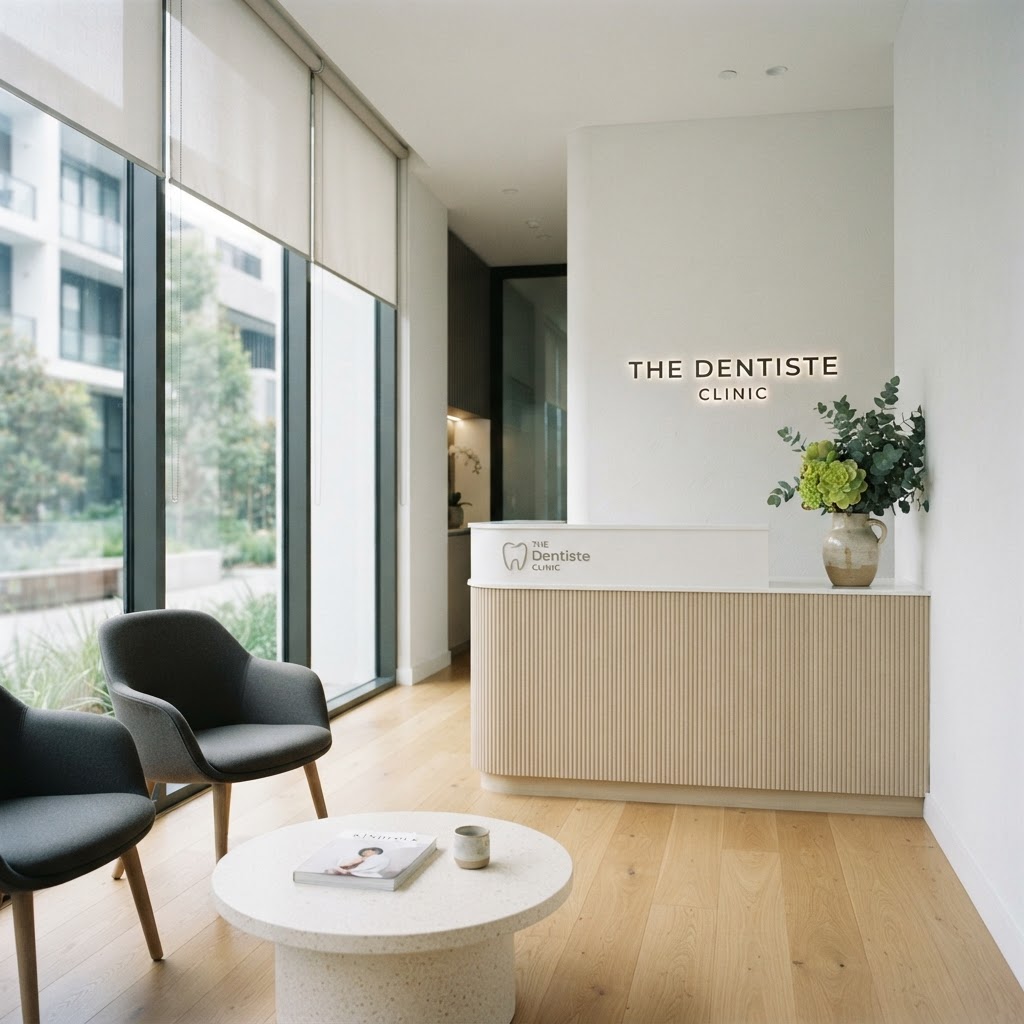
A dental site has to overcome the reluctance
Dentistry has a marketing problem most industries don't: a meaningful share of your potential patients don't want to be there. They're nervous, they've been putting it off, and they're choosing a clinic partly on which one feels least stressful. A dental site that ignores this — that's all smiling models and pristine equipment — misses the actual job. The job is to make a nervous person feel they'll be looked after, and to make booking so easy they can't keep putting it off.
Here's what a dental site needs.
Services, clearly, including the ones people put off
List what you do — "general check-ups and cleans", "fillings and crowns", "root canals", "wisdom teeth", "teeth whitening", "Invisalign", "emergency dental". The person who's been putting off a root canal for a year needs to land on a page that says "root canal", explains it plainly, and reassures them. A homepage that says "comprehensive dental care" doesn't help them decide. Specific service pages are the SEO and the reassurance in one.
Address the fear directly
The thing that sets a good dental site apart is that it talks about nervous patients. A short, honest paragraph — "we see a lot of nervous patients, here's how we make it easier" — does more than any photo of a spotless surgery. It tells the reluctant person "you're normal here, and we've thought about you". Clinics that do this book the patients others lose.
Booking and emergency, obvious
Dental has two booking modes: routine (book a check-up) and emergency (I'm in pain now). Both need to be one tap away. An emergency phone number in the header, visible on every page, is non-negotiable — people in dental pain don't scroll. A routine booking button to your system, obvious. Health is a now-business. (More on friction: how to get more leads from your website.)
Meet the dentists
Like any health clinic, the team is the product. A page with a photo and short bio of each dentist — qualifications, what they enjoy treating, a human detail — builds trust. Real photos, not stock. This is the part that converts a "maybe" into a booking, and it's where most dental sites are thinnest.
Local search is how new patients find you
People search "dentist [suburb]", "emergency dentist [suburb]", "Invisalign [suburb]". The clinics that show up are the ones structured for it. A dental site with clear service pages and location pages books more patients from search than one that doesn't. We wrote the diagnosis: why your website isn't getting any customers.
The pages a dental clinic needs
A homepage with services, an emergency number, and a book button. A page per service. A team page. A location/contact page with hours, address, and booking. That's the spine. A few plain-language articles ("what to expect at a root canal") build trust and search. (How many pages: how many pages a small business website should have.)
What to skip
Stock photos of impossibly white teeth. Videos of procedures nobody wants to watch. Anything that makes the site feel clinical rather than caring. A dental site should feel calm, honest about the nervousness, and easy to book from — including for the person in pain right now.
What it costs
A proper dental site — calm, trust-led, structured for local search — sits below what most clinics assume. The numbers: how much a website costs. For a clinic, it pays for itself in a few weeks of new-patient bookings.
See yours before you pay
Pick a style below, tell us about your clinic and your services, and we'll mock up your site for free — no payment, no obligation. You'll see whether the version of your clinic we'd put online is the one that gets the reluctant patient to book.