
Website Design for a Physiotherapy or Allied Health Clinic
A clinic site has to feel calm, competent, and easy to book from. Here's what it needs, and the team-page investment most clinics miss.
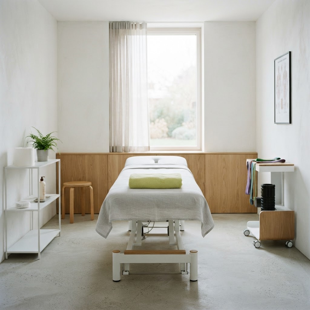
A health clinic site has to feel calm and competent
Someone visiting a physiotherapy or allied health site is usually in some kind of pain or uncertainty — a sore back, a post-surgery question, a child's development concern. The site's job is to make them feel they've come to the right place, quickly, without overwhelming them. The wrong tone — clinical to the point of cold, or salesy in a way health shouldn't be — loses them. The right tone is calm, specific, and human.
Here's what a clinic site needs, and what to leave out.
Conditions and services, in plain words
List what you treat and what you offer, in the words people search. "Back and neck pain", "sports injuries", "post-surgery rehab", "women's health", "paediatric physio". The person searching "physio for lower back pain [suburb]" needs to land on a page that says exactly that. Each condition or service with its own page, if there's enough to say, is both the SEO and the reassurance — it tells the visitor "yes, we do your thing". A homepage that says "comprehensive allied health" tells them nothing.
Make booking easy and obvious
Health bookings are often impulse — someone decides at 7am on a sore knee that they need help. A "book now" button that goes to your booking system (Cliniko, Nookal, whatever you use), visible on every page, is the single most important element. Bury it behind a contact form and you lose the people who were ready to book. Health is a now-business, not a research-business. (More on this: how to get more leads from your website.)
Meet the team
For a health clinic, the team is the product. People want to know who'll be treating them. A page with a photo and a short, human bio of each clinician — qualifications, interests, what they treat — does more than any description of the clinic's facilities. This is the part that builds trust, and it's the part most clinic sites under-invest in. Real photos of real clinicians, not stock images of smiling people in white coats.
Local search is how patients find you
People search "physio [suburb]", "women's health physio [suburb]". The clinics that show up are the ones structured for it — service pages, location pages, content answering the questions people search. A clinic that does this well books more patients from search than one that doesn't. We wrote the diagnosis: why your website isn't getting any customers.
The pages a clinic needs
A homepage with conditions, a book button, and the team. A page per service or condition. A team page. A location/contact page with hours, address, and booking. That's the spine. A few articles on common conditions ("what to expect after a knee replacement") build trust and search over time. (How many pages: how many pages a small business website should have.)
What to skip
Stock photos of models in pristine gym clothes doing a stretch. Dense anatomical diagrams nobody asked for. Autoplaying video. Anything that makes the site feel like a hospital rather than a place a person will be looked after. A clinic site should feel calm, human, and easy to book from.
What it costs
A proper clinic site — calm, trust-led, structured for local search — sits below what most practices assume. The numbers: how much a website costs. For a clinic, it pays for itself in a few weeks of new-patient bookings.
See yours before you pay
Pick a style below, tell us about your clinic and what you treat, and we'll mock up your site for free — no payment, no obligation. You'll see whether the version of your clinic we'd put online is the one that feels like the right place.