
Website Design for a Florist in Australia
A florist site has to sell the feeling, then make ordering effortless. Here's what it needs — real photos, occasion-based shop, and same-day delivery front and centre.
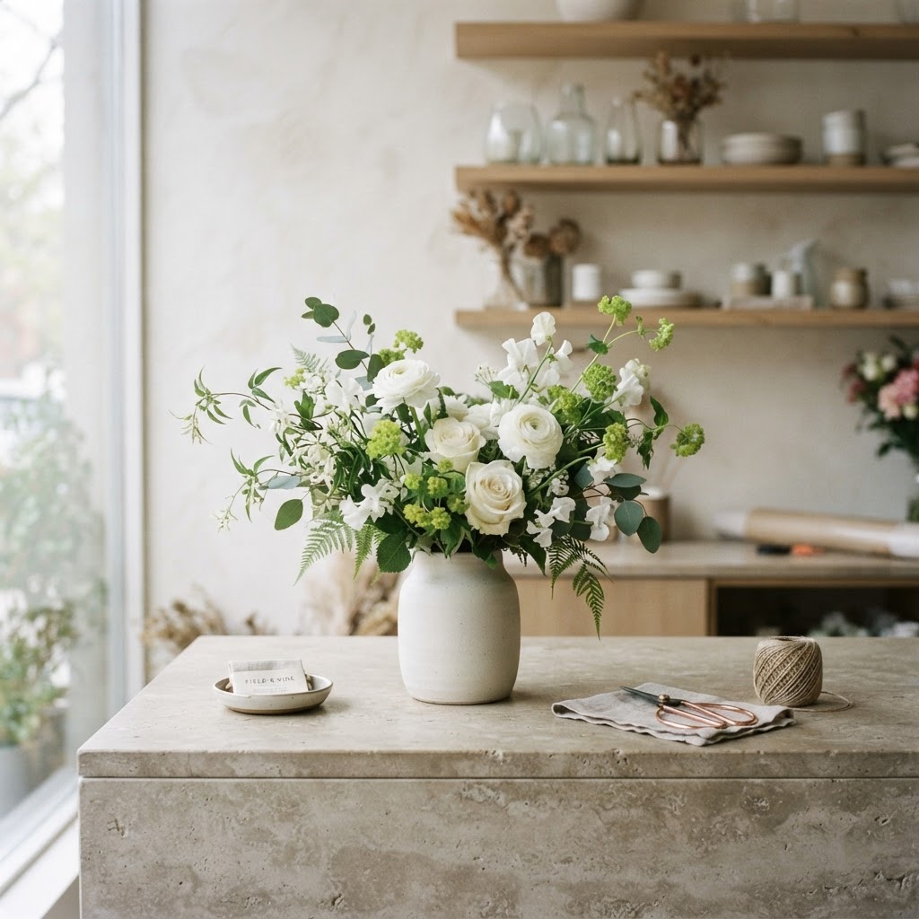
A florist site has to sell the feeling, then make ordering easy
Floristry is a feeling business. People buy flowers for birthdays, anniversaries, sympathy, apologies, just-because — and they're buying the emotion the flowers will carry, not the flowers themselves. A florist site that just lists products misses this; a good one captures the feeling in the photography and the small touches, and then makes ordering the right arrangement effortless. The sites that fail look like product catalogues; the ones that work look like a gift you'd want to give.
Here's what a florist site needs.
Photography that captures the feeling
For a florist, photos are everything. Beautiful, real photos of your arrangements — not stock, not generic. The difference between a florist that books and one that doesn't is often just the photography. If your site has dark phone photos or stock images, it's losing orders to the florist whose photos make someone want to send flowers right now. This is the highest-leverage thing you can do, and it's where most florist sites under-invest.
Occasion-based organisation, not just product lists
People shop by occasion, not by flower type. Organise the site around why people buy: "birthday flowers", "anniversary", "sympathy and funeral", "new baby", "thank you", "just because". A visitor who's buying for a birthday wants to land on birthday arrangements, not scroll through a list of every product. This is how a florist site converts, and it's the opposite of how most are organised.
Same-day delivery, clear and bookable
A huge share of florist orders are last-minute — "I need something today". If you offer same-day delivery, this is your competitive advantage and it needs to be impossible to miss: in the header, on every page, with the cut-off time. A florist site that buries same-day availability loses the orders that same-day exists to capture. Make the delivery options and cut-off times obvious.
Make ordering effortless
The order is the whole point. A clear add-to-cart, a delivery date picker, a card message field, and a smooth checkout. The friction of "call us to order" loses the people who were ready to buy now. Florist orders are often impulse — someone decides at lunchtime to send flowers — and the site has to be ready for that impulse. (More on conversion: how to get more leads from your website.)
Local search and local delivery
People search "florist [suburb]", "flower delivery [suburb]". The florists who show up are the ones structured for it. A site with clear location and delivery-area content books more than one that doesn't. Local is the whole game for a florist. We wrote the diagnosis: why your website isn't getting any customers.
The pages a florist site needs
A homepage with your best work, same-day delivery, and a shop button. An online shop, organised by occasion. A delivery-areas page. An about page — people buy from florists they feel a connection to. A contact page. That's the spine. (How many pages: how many pages a small business website should have.)
What to skip
Stock photos of generic bouquets. A product list with no occasion context. A checkout that asks for everything. Anything that makes ordering feel like a chore rather than a small, lovely gesture. A florist site should feel like a gift, and make sending one effortless.
What it costs
A proper florist site — feeling-led, occasion-organised, structured for local search — sits below what most florists assume. The numbers: how much a website costs. For a florist, it pays for itself in a few weeks of orders.
See yours before you pay
Pick a style below, tell us about your florist and your delivery area, and we'll mock up your site for free — no payment, no obligation. You'll see whether the version of your shop we'd put online is the one that gets the order.