
Website Design for a Cafe or Restaurant in Australia
A cafe site has one job: get them through the door. Here's what it needs — and the PDF menu mistake that loses every mobile visitor.
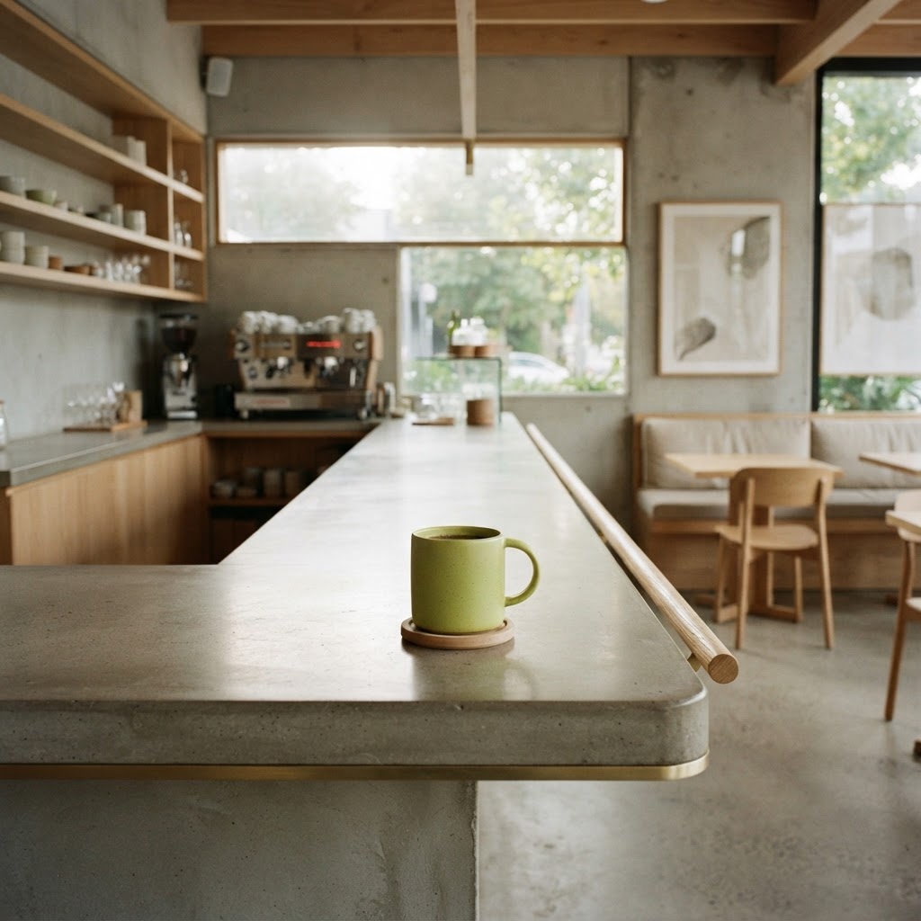
A cafe site has one job: get them through the door
A cafe or restaurant website isn't complicated, and that's exactly why so many of them are bad. Owners overthink it — full-screen video, music that autoplays, a menu that's a PDF that won't load on a phone — and miss the one thing a hungry person with their phone out actually wants: to see the food, see the vibe, find the address, and decide if it's tonight.
Here's what a hospitality site has to do, and the handful of things almost every cafe gets wrong.
The menu, on the site, on mobile, without a PDF
This is the single most-failed thing in hospitality sites. The menu is a PDF. The PDF is three megabytes. It doesn't load on a phone in a cafe parking lot. The person leaves and picks the place next door. Put your menu on the site as actual text — searchable, fast, readable on any phone. A PDF menu is a quiet way to lose every mobile visitor who's already in the area.
Photos that make someone hungry
People choose restaurants with their eyes. A few real photos of your dishes and your room — properly lit, not stock — do more than any description. The bar is low and most cafes are under it: dark phone photos, or no food photos at all, or worse, stock images of food that isn't yours. Put six to ten real photos of your actual dishes and your room on the homepage. That's the pitch.
Hours, address, and how to book — obvious, on every page
The most common reason a restaurant site loses a customer is that the hours or address are hard to find, or wrong. Put them in the header or footer of every page. If you take bookings, a one-tap booking link. If you're walk-in only, say so plainly. The number of cafes losing customers because the site says "open" but they're closed on Mondays is staggering. Keep the hours current.
Local search is how new customers find you
Nobody scrolls past the first few results for "cafe [suburb]" or "dinner [suburb]". If your site isn't structured to show up there, you're invisible to the people already in the area looking for somewhere to eat. This is the work that fills tables, and it's the work most cafe sites skip. We wrote the full version here: why your website isn't getting any customers.
What a cafe site should have
A homepage with food photos, hours, address, and a one-line "what we are" ("neighbourhood café, all-day brunch, north Brisbane"). A menu page, as text. A gallery if you have the photos. A contact/location page with a map. That's the spine. You don't need a blog, an events page nobody updates, or a "our story" essay that belongs on the menu. (How many pages: how many pages a small business website should have.)
What to skip
Autoplay music. Full-screen background video that eats mobile data. A "newsletter signup" popup before the page loads. The PDF menu. Anything that delays the hungry person with their phone out. A cafe site should load fast, look delicious, and tell you where it is. Everything else is in the way.
What it costs
Less than a few busy nights of the customers it brings in. A proper hospitality site — fast, photos-led, mobile-friendly menu, structured for local search — sits well below traditional agency pricing. The numbers: how much a website costs.
See yours before you pay
Pick a style below, tell us about your cafe or restaurant and your suburb, and we'll mock up your site for free — no payment, no obligation. You'll see whether the version of your place we'd put online is the one that gets people through the door.